Acrylic: Interference Colors
Illuminate Acrylic Paintings
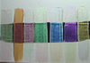
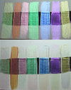
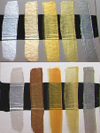
Interference colors exemplify what Braukman calls a "hidden technique" because the viewer never quite knows why the paint looks different in varying light conditions. The mystery behind this relatively new medium is not so mysterious: the paint's pigments are made from mica minerals that have been coated with a layer of titanium dioxide. Coating the mica particles with differing amounts of titanium dioxide determines which color is reflected. In contrast to iridescent pearl pigments, which reflect white (the total color spectrum), interference colors reflect only one color from the total spectrum and therefore should be applied in a thin layer over a base acrylic color. Painting interference colors over a light color will yield a complementary color, while painting over a dark color allows viewers to see the labeled interference color. (The effects of interference colors are more visible when the paint has been applied over dark colors because dark colors absorb light rays.) The reflective qualities of opalescent mica are also enhanced when the paint is applied over dark colors because the light absorption cancels out the transmission of the complementary color. The visual effects of interference color also depend on the relationship between neighboring colors on a canvas because one color will pick up the other's complement. Braukman also emphasizes that interference colors must be used in moderation. "You don't want to use a lot," she explains, "because it's like adding gold leaf or brilliant color. When you look at it at first, you don't see much, but when you look at it again, it shimmers." For example, she often recommends in her workshops that realistic painters use interference colors just to add highlight and sparkle over small, dark portions of their paintings. For students who want to paint their entire composition with interference colors, Braukman reminds, "The main idea is that you really want to highlight something." Braukman speculates that more artists are discovering the creative possibilities that come with using interference colors because they offer yet another way for artists to manipulate color. "More artists are also using them now because more brands are coming out with interference colors," she explains. For her own work, Braukman uses and recommends Golden Interference Colors, which come in blue, gold, green, red, orange, oxide green, and oxide red. She also suggests that some artists may want to mix interference colors with gels or mediums in 10 parts gel or medium to one part interference color. About the Artist
Mary Alice Braukman is a signature member of the National Watercolor
Society, the Georgia Watercolor Society, the Kentucky Watercolor
Society, and The Florida
Watercolor Society, where she has previously served as president and
executive board member. Born and raised in Tampa, and now living
in St. Petersburg,
Florida, and spending the summers in North Carolina, Braukman helps
with the Kanuga Watercolor/Watermedia Workshops, an annual weeklong
school. The
artist is in much demand as a workshop instructor and a show juror,
and her work has been juried into numerous watercolor exhibitions over
the past 20
years. Braukman was the guest editor of the fall 2001 issue of Watercolor magazine. Her art is in many corporate and private collections,
and she has been represented by Nancy Markoe Gallery, in St. Pete Beach, Florida, for more than 20 years. |